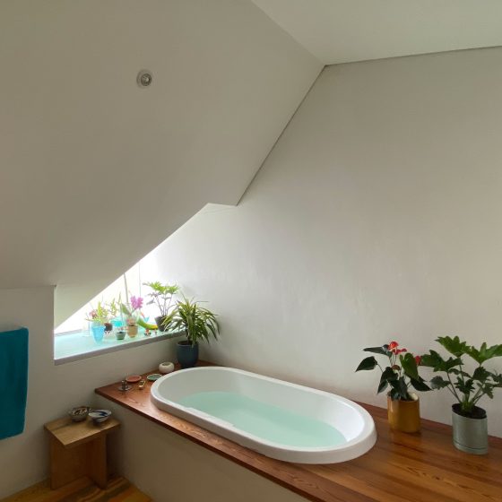
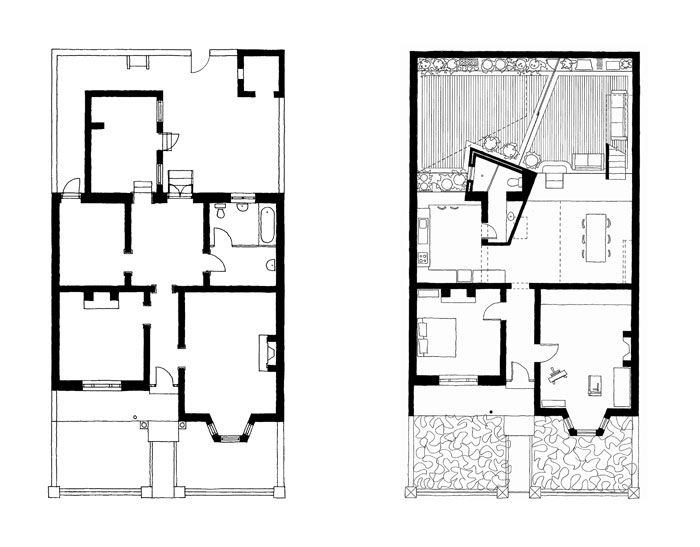
Two roof forms, extruded perpendicular to the main roof, bring light into the depth of the plan. Most of the light sources in the 10 x 10 room are concealed with light made visible though the way it falls on walls.
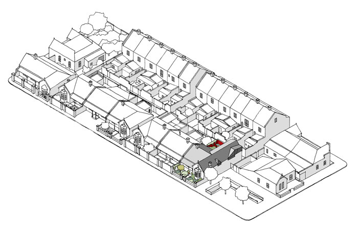
Typical of its time and its urban typology, this Victorian row house has an elaborate front façade with decorative plaster and cast iron work. The front rooms have generous proportions and large windows facing Table Mountain.
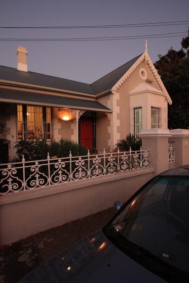
The architectural quality of the front was not maintained throughout the house. The back rooms were badly lit and the kitchen in particular was a squat space and it cast a shadow over the courtyard.
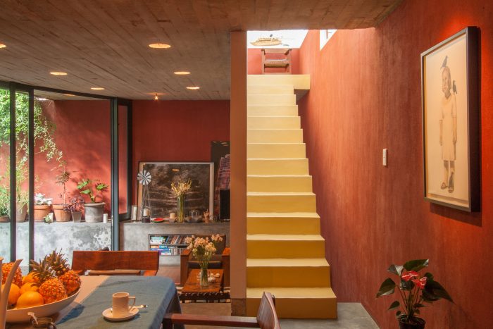
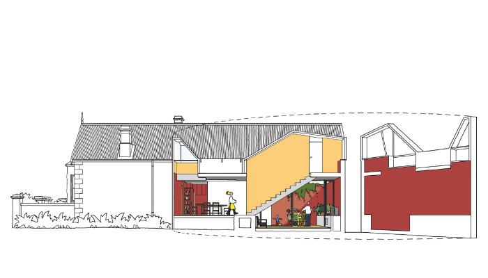
In redeveloping the house, the roof behind the front gable was extended to the back of the property to gain additional space and the interior was adjusted to a contemporary way of life. At a functional level this meant the integration of living spaces into one large space and a direct connection to a courtyard where outside living and dining can occur.
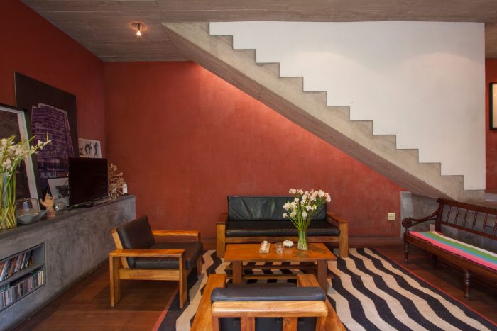
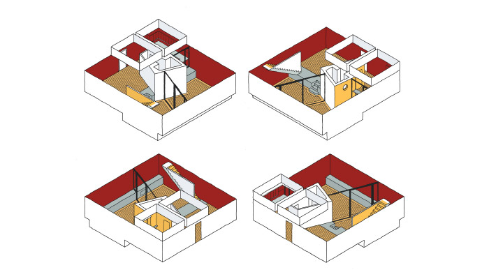
In the architecture, a dialectic between interconnected spaces and the room-based architecture of the original building is set up. As much as the cellular character of the back rooms was undone through demolition, a new 10m x 10m room was created that incorporated both inside and outside space.
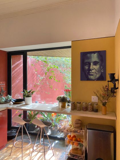
The symmetrical access into the large back room is deflected towards the dining and living rooms by the angled wall of the bathroom. This deflection is amplified by semi-circular circulation through this 10 x 10 room. The circulation pattern is amplified by connections made between the various functions within the 10 x 10 space; the original Oregon Pine floor connects the kitchen, entry and dining room, the off-shutter concrete soffit connects the dining and living rooms and the new wooden floor connects living room and the outside courtyard. The result is an interconnected free flowing space within the confines of a larger room.
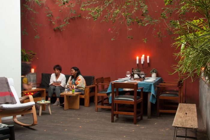
The physical characteristics described above are brought to life through light. Two roof forms, extruded perpendicular to the main roof, bring light into the depth of the plan. Most of the light sources in the 10 x 10 room are concealed with light made visible though the way it falls on walls. The apparent size of the space is exaggerated by concentrating the light on the periphery of the plan.
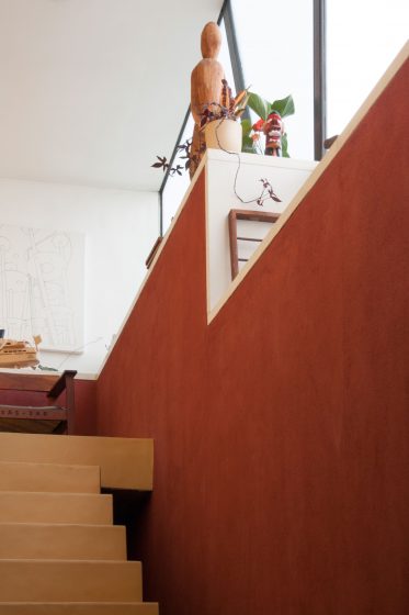
Strong form making and manipulation of space could lead to a manicured, formal space that antagonises the accommodation of daily life within the house. Therefore the purity of the form is antagonised by creating ledges that can accommodate shelves, electronic equipment, plants and storage.
